My favourite photo
Last week we were tasked to submit a photo which we like and has a meaning to us. Below we can see my favourite photo called "performance still" by Mona Hatoum . This image was taken in 1985 and in my opinion its meaning is that it represents the strings of normalities that people are attached to within society.I also like this image because it is black and white, I particularly like black and white images because it allows you to focus more on the small details in a picture. 
|
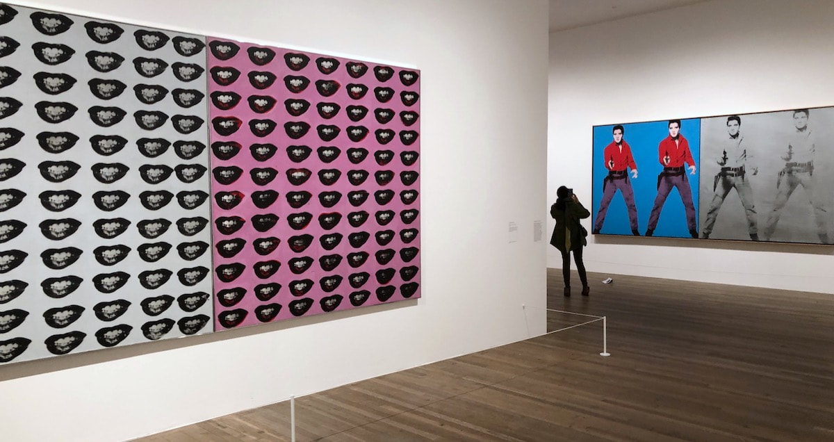
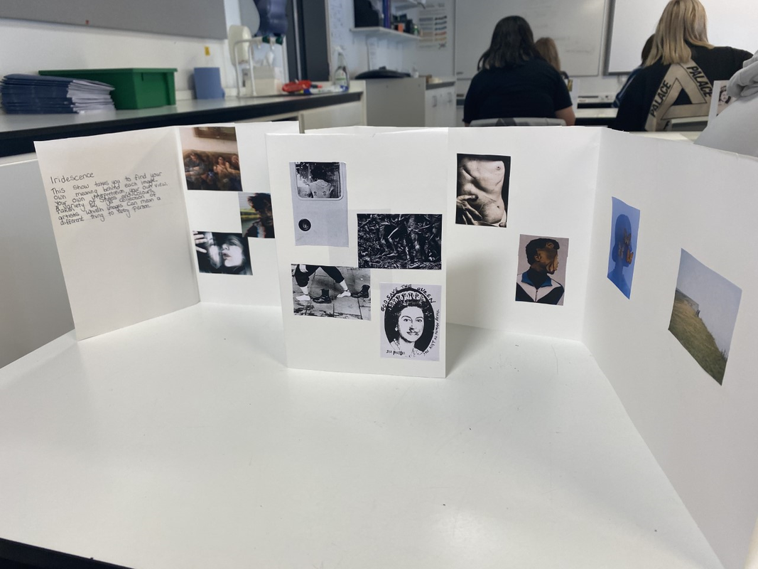
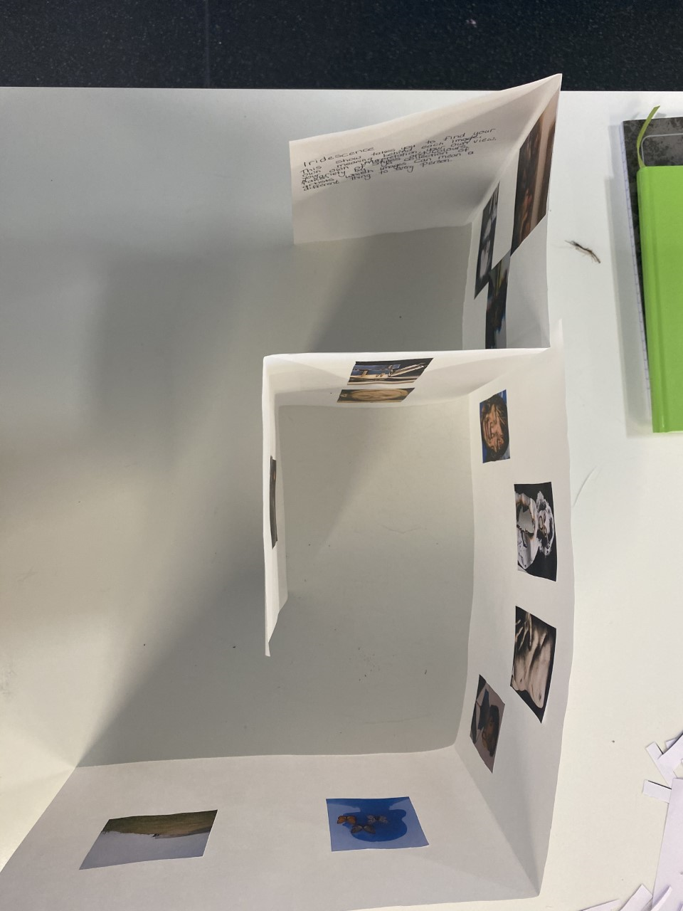
Other photography exhibitions An exhabiiton I went visit a few weeks ago was the Andy Warhol exhibition in the Tate modern. This exhibition focused on mainly bold vibrant colours with picture mainly on large canvas'. Many images were also edited replicas of the photos next to it. These however are what we would expect to see as they reflect some of his previous work. I think actually seeing photo exhibitions is really important in photography, this is because you can really see how artists grouped and placed there images on walls in the exhibition. This leads me on to talking about how photographs in exhibitions are normally placed. Artists like Andy Warhol use mainly whole walls to show one picture due to his large canvas. However others photographers may but more but smaller pictures on each wall. The exhibition I made below I believe reflected the idea of small spaced out images on each wall. I do however admire Wolfgang Tillmans approach to positioning his work, this is because he physically builds what his exhibition layout would be, then he can spend months placing his photos on each wall of the replica. We did a task then in class kind of like what Wolfgang did, I found this task very interesting and useful as you can have a better picture of what each photo would look like in your exhibition when making a 3d model. |

How did I group my images?
I grouped my images based on colours, themes and genre. For example some groups included body focus, abstract, nature, Edited images and black and white/old photography. some images I placed on walls alone, this is because either they didn't fit into a category or they were an image I liked and wanted to stand out within my exhibition. With placing my images i tried to make each wall stand out from the next to make it aesthetically pleasing to the eye. Furthermore i also grouped my images in a max of 3 per group in order to make the would not look cluttered in each room.
I grouped my images based on colours, themes and genre. For example some groups included body focus, abstract, nature, Edited images and black and white/old photography. some images I placed on walls alone, this is because either they didn't fit into a category or they were an image I liked and wanted to stand out within my exhibition. With placing my images i tried to make each wall stand out from the next to make it aesthetically pleasing to the eye. Furthermore i also grouped my images in a max of 3 per group in order to make the would not look cluttered in each room.

|
The title of my exhibition
The title of my exhibition was "iridescence", this means he changing of an object from the different angle you look at it. I believe this is fitting for my exhibition as none of the pictures necessarily match each other and are all different. This means that every photograph can be interoperated differently by each different viewer. As all these photographs have been taken by different photographers they each had their own intention and meaning behind each picture so no meaning is the same. I think my title was pretty creative and a simple yet an obsqure word to use. |
Final product/Evaluation
Overall I believe I created an interesting and well thought out exhibition. I liked the layout of my design and the way in which the photographs were grouped and spaced out. However the description could of been improved as I only spoke about how it links the photos to the title and not the actual photos themselves. If I were to do it again I would of probably also done it on card to make some of the walls look less flimsily. However overall i was very pleased with the final result. |
|
