Wrong?
What can mistakes tell us about photography?
Caitlin Barcoe
A-level photography
Personal investigation
2021-22
Thomas Tallis school
A-level photography
Personal investigation
2021-22
Thomas Tallis school
What is a good photograph? I believe we can all agree on a minimum criteria . “Kodak's top tips for great pictures” are:
But if we break away from this criteria does it necessarily result in a “bad photograph”. This is what I have considered in this investigation.
I have consulted Kim Beil’s collection of old photo guides that discuss “How to take good pictures”. The example below (Fig.1) was published in 1981 by Kodak.
Inside the book we are presented with a ‘dummies’ guide’ for how to use a camera to take good pictures. The guide takes you through every step from how to operate your camera, how to hold it the correct way and how to even use lighting to flatter elderly people.
- The state or the quality of producing something visibly clear (Focus)
- The subject fits into the frame
- Lighting is clear
- Finger not obstructing the lens
But if we break away from this criteria does it necessarily result in a “bad photograph”. This is what I have considered in this investigation.
I have consulted Kim Beil’s collection of old photo guides that discuss “How to take good pictures”. The example below (Fig.1) was published in 1981 by Kodak.
Inside the book we are presented with a ‘dummies’ guide’ for how to use a camera to take good pictures. The guide takes you through every step from how to operate your camera, how to hold it the correct way and how to even use lighting to flatter elderly people.

Fig 1. Kim Beil collection - How To Take Good Pictures: A Photo Guide by Kodak
Even Though Kodak argues that if you follow this guide you will be able to take ‘good’ pictures, we could argue that artists (like ourselves) using photography would find this guide useless. This is because we are not necessarily looking for conventionally successful images. As artists we aim to take images that represent ourselves and our personal view of the world so the armateur standard won’t cut it. Kodak produced these guides so users could make the most of their products and have a positive experience. Furthermore, many people in the 70s/80s may have never used a camera before so they needed clear instructions in order to learn the basics. Books like these focus more on the everyday, amatuer market whilst ‘artists’ like ourselves may be more interested in the conceptual or creative potential of photography.
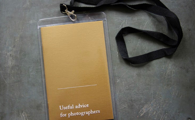
Ivan Gravlejs is an artist who reflects the feelings photographers may have towards these “good picture” guides (Fig. 2). He takes a mocking approach to these books with his “Useful advice for photographers” 2017
Ivan Gravlejs is an artist who reflects the feelings photographers may have towards these “good picture” guides (Fig. 2). He takes a mocking approach to these books with his “Useful advice for photographers” 2017
|

|
Fig. 2 Ivan Gravlejs - Useful advice for photographers, 2017
On the left we can see the book presented on a lanyard. I really like this format as it suggests that he expects photographers to carry it around and refer to it. On the right I have included a page extract of the book. As you can see the book includes examples of “right” and “wrong” along with small, deadpan and ironic captions. Eg. “13. In bad weather it is better not to take photos.”
One important aspect of quality in photography has traditionally been technical accuracy - correct exposure, sharp focus, good lighting - combined with rules associated with composition - no obstructions and rule of thirds, for example. Gravlejs illustrates the mistakes beginner photographers tend to make before they have “mastered” these rules. From this project I was practically inspired to create some right and wrong images myself. Using my phone, the camera most commonly used by beginner photographers, I took a series of images that included some “amateur mistakes”. These included portraits with motion blur, light flares and taking portraits with inappropriate framing, cutting off parts of the subject’s face, for example (Fig.3).
One important aspect of quality in photography has traditionally been technical accuracy - correct exposure, sharp focus, good lighting - combined with rules associated with composition - no obstructions and rule of thirds, for example. Gravlejs illustrates the mistakes beginner photographers tend to make before they have “mastered” these rules. From this project I was practically inspired to create some right and wrong images myself. Using my phone, the camera most commonly used by beginner photographers, I took a series of images that included some “amateur mistakes”. These included portraits with motion blur, light flares and taking portraits with inappropriate framing, cutting off parts of the subject’s face, for example (Fig.3).

|
|
Fig.3 Caitlin Barcoe-“Wrong” images, 2021
I decided to look back through my images to try and find examples that I had previously discarded due to technical mistakes. I came across a collection of photographs I had taken a couple months earlier on a roll of film. A lot of the images were unfortunately either very underexposed, overexposed or had very poor framing so I had previously discarded them. I believe this happened as I used a cheap disposable camera and many of the images were taken during the night where the subject was too far away. However I thought some of these images would be perfect material for my personal investigation.
Below (Fig.4) is one of the images I had previously discarded. As you can see by the grainy quality, it is very underexposed. You can see part of a figure, however most of their body has been consumed by a shadow.
Below (Fig.4) is one of the images I had previously discarded. As you can see by the grainy quality, it is very underexposed. You can see part of a figure, however most of their body has been consumed by a shadow.

Fig. 4 Caitlin Barcoe - Disposable camera experiment, 2021
According to Kodak, the image above would be considered unsuccessful as it contains many basic mistakes - poor composition, underexposure etc. Indeed, high street photo labs used to use a range of stickers which were attached to pictures they felt were unsuccessful (Fig. 5).

Fig. 5 Example of sticker used by high street photo labs
It might be argued that mistakes in photography can be categorised in three ways: technical, aesthetic and ethical. Aesthetic ‘mistakes’ seem to me to be entirely subjective. Tastes vary and one person’s wrong is another’s right. Whilst I am interested in ethical mistakes, pictures that deliberately or accidentally harm someone, what really intrigues me are those technical errors, related to the operation of the apparatus of photography, that seem to reveal something about the nature of the medium. This investigation explores technical mistakes in photography and asks the questions, what can these errors teach us about photography? In what sense do photographic errors reveal the real nature of the photographic image?
But what precisely is a technical error in photography? These can include anything that is caused by the inaccurate operation of the apparatus of photography. This could include issues related to camera operation and the treatment of light sensitive material used to “fix” the image. Photographers, it might be argued, are keen to take control, to ‘master’ their equipment and to assert their superiority over non-photographers. In order to do this, they seek to remove chance and accidents from their processes. I’m interested in the way mistakes and chance can influence our image making. Mistakes are mostly due to ignorance about how to operate the equipment “correctly”. Threshold concept 6 suggests that chance plays a role in all photographs, and that “all photographs rely on chance more or less”. So the question we might ask ourselves as photographers is, do we choose to embrace chance, fight it or just tolerate it.
The idea of chance however is surrounded by negative connotations. Chance implies a loss of control, reliance on luck or an accident. I’m exploring the use of chance in my work by treating chance as an ally rather than an enemy in my creative process. However, I ask myself the question, how do you deliberately produce mistakes or “wrong” photos? As individuals we all have millions of different opinions, ideas and perspectives so I would presumably have to make my mistake visible enough to be noticed by a viewer.

Fig. 6 John Baldessari - Wrong, 1967
The image above (Fig.6) is titled “Wrong” and was produced by John Baldessari, also known as “The father of conceptual art”. Conceptual art began to emerge in the late 1960s and it can be argued that the idea of “good pictures” began to change among artists at this point.
This image is an example of a photo with lots of aesthetic mistakes that the majority of people would notice and agree about. However our unconscious relationship with the nature of photography may change how we view this image. The subject is standing too far away from the photographer and the tree looks as though it is emerging out of the man’s head. The image is badly framed since the tree and car have been crudely cropped and we can see far too much road in the foreground. However, what can be said about the title of this image, “Wrong”? Baldessari has purposely used a blunt yet effective title which reflects the process of his image making. The title acts as a challenge to the audience to recognise the various errors on display. However, once we have smiled at the classic mistake of the tree emerging from the head, something all amateur photographers have done, we might also reflect on how this ‘mistake’ occurs only in photographs and not in real life. Photographs flatten space so that objects, which in reality are some distance apart, can seem to be joined together once they are printed on a flat surface. Baldessari uses gentle humour to encourage us to question the medium of photography and the way it represents the three dimensional world. This is further enhanced by screen printing the photograph onto canvas and paying a professional signwriter to add the text, questioning the authorship of the work through a mechanical process combined with a sub-contract. Baldessari is unpicking our relationship to photography and photography’s relationship to the art world in this apparently simple image.
Another aspect of photographic “mistakes” that interests me is the treatment of light-sensitive material itself, whether this be film, paper or digital sensor. The printing and developing process can affect the appearance and stability of an image. An example of this is a project by Matthew Brant called “Lakes and Reservoirs” 2012 (Fig. 7).

Fig.7 Matthew Brandt- Lakes and reservoirs, 2012
For this project Brandt would take photographs of lakes, and then collect water from the lake he had photographed. Once back in his studio, he would submerge the printed cibachrome image in the water for a period of time. The water would then interact with the chemistry in the print to create patterns and shapes like the illustration above. This would be a long process and could take many months to complete. What emerges appears to be a damaged landscape photograph, an unrecognisable view of the natural world. However, Brandt’s process reveals the living, microbial quality of the water at the same time as reminding us of the various liquids that create the photographic image.
I was practically inspired by this project to create a similar experiment with my own images. I gathered various recycled and technically/aesthetically wrong images and got them commercially printed onto matte photographic paper. I submerged them in water and left them untouched for 10 days. The effects were similar to Brandt’s, however sections of my images were completely wiped off of the paper leaving only fragments of visible material. Brandts images are therefore conceptually richer as the obscuring of the subject by the lake water is a kind of chance collaboration rather than the water in my experiment defacing the image (Fig. 8). If I were to do this experiment again I would therefore leave my images in the water for less time in order for the water to interact yet not consume my photographs and consider using a water source that is related in some way to the subject of the pictures.
I was practically inspired by this project to create a similar experiment with my own images. I gathered various recycled and technically/aesthetically wrong images and got them commercially printed onto matte photographic paper. I submerged them in water and left them untouched for 10 days. The effects were similar to Brandt’s, however sections of my images were completely wiped off of the paper leaving only fragments of visible material. Brandts images are therefore conceptually richer as the obscuring of the subject by the lake water is a kind of chance collaboration rather than the water in my experiment defacing the image (Fig. 8). If I were to do this experiment again I would therefore leave my images in the water for less time in order for the water to interact yet not consume my photographs and consider using a water source that is related in some way to the subject of the pictures.

|

|
Fig.8 Caitlin Barcoe- Lakes and reservoirs project, 2022
To gather more inspiration the project I looked at was “Buried” by Stephen Gill. The photographs from the book (Fig. 9) were taken in Hackney Wick and later buried there by Gill. However the amount of time the images were left underground varied depending on the amount of rainfall. The depth that the pictures were buried also varied as did their positioning underground. Not knowing what the image would look like once dug up introduced an element of chance, which in relation to this investigation, I found appealing.

Fig.9 Stephen Gill - Buried, 2006
What I enjoy about both projects is how they both rely on the entirely unpredictable effects of water interacting with photo chemistry. They are therefore very similar since both artists have engaged positively with change to produce images that they cannot control to reveal something about natural processes.
Overall after compiling all my research I really liked the idea of creating a “how to take good photos book” but perhaps using examples of images with technical errors or images I had manipulated to not fit the conventionally “good” standard.
However, through this investigation I learnt a lot about myself and my photography practice. I learnt about the ways in which I can embrace the element of chance in my work by choosing to rely on it rather than fighting against it. I also learnt that as a photographer I struggled to break away from my comfort zone and what my own idea of a “good” image was. This was my biggest hurdle to overcome and a difficulty I didn’t think I would face. This is because I initially had the mindset that taking bad or wrong images wouldn’t be difficult at all, however when I tried to take these images on purpose I struggled. I am however proud of what I’ve learnt about myself and my work through this project and I believe I have created a successful theoretical and practical investigation.
2104 words
Bibliography
Higgins,Jackie,Why it does not have to be in focus,Thames and Hudson, 2013
Geimer, Peter, inadvertent images, The university of Chicago Press, 2018
Baldessari, John, Pure beauty, Los Angeles county Museum of Art, 2009
Iversen, Margaret ED., Chance, The MIT press, 2007
Kelsey, Robin, Photography and the art of Chance, Belknap Harvard, 2015
Kodak, How to take good pictures, Kodak, 1981
Gravlejs, Ivars, Useful advice for photographers, Dienacht publishing 2016
Brant, Matthew, Lakes and Reservoirs,Damiani and Yossi Milo gallery, 2012
https://www.stephengill.co.uk/portfolio/portfolio/nggallery/album-1-2/buried
